Advanced Drop Shadow Effects Using CSS3
In my last blog post, I explained how to give simple box-shadows. Wasn’t it simple and cool?? Box-shadow is a pretty powerful property in modern browsers. With just six little values, you can make some really neat stuff. Box-shadow has six properties: inset, left, top, blur, size, and color. Today, we will learn about some advanced drop-shadow effects using :after and :before, these can be useful for adding effects without putting more markup in and can be applied to a single element. A couple of pseudo-elements are generated from an element and then pushed behind it.
:after and :before
The “:before” pseudo-element can be used to insert some content before the content of an element. Similarly, the “:after” pseudo-element can be used to insert some content after the content of an element.
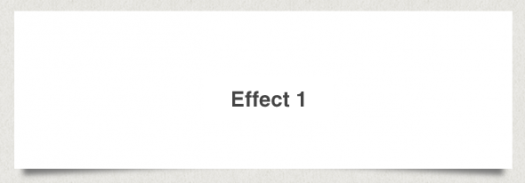
This effect will add shadows to the bottom corners of the boxes to create a lifted corner look on the boxes. This effect uses both the :before and :after properties to create new elements used for the corners.
HTML: <div class=”box effect1″>
<h3>Effect 2</h3>
</div>
CSS: .box h3 {
text-align:center;
position:relative;
top:80px;
}.box {
width:70%;
height:200px;
background:#FFF;
margin:40px auto;}/*==================================================
* Effect 1
* ===============================================*/.effect1 {
position: relative;
}.effect1:before, .effect1:after {
z-index: -1;
position: absolute;
content: “”;
bottom: 15px;
left: 10px;
width: 50%;
top: 80%;
max-width:300px;
background: #777;
-webkit-box-shadow: 0 15px 10px #777;
-moz-box-shadow: 0 15px 10px #777;
box-shadow: 0 15px 10px #777;
-webkit-transform: rotate(-3deg);
-moz-transform: rotate(-3deg);
-o-transform: rotate(-3deg);
-ms-transform: rotate(-3deg);
transform: rotate(-3deg);
}
.effect1:after {
-webkit-transform: rotate(3deg);
-moz-transform: rotate(3deg);
-o-transform: rotate(3deg);
-ms-transform: rotate(3deg);
transform: rotate(3deg);
right: 10px;
left: auto;
}
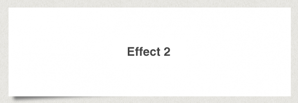
This uses half of the effect approve and will add a lifted corner to the bottom left of the box.
HTML: <div class=”box effect2″>
<h3>Effect 3</h3>
</div>
CSS: .box h3 {
text-align:center;
position:relative;
top:80px;
}.box {
width:70%;
height:200px;
background:#FFF;
margin:40px auto;}/*==================================================
* Effect 2
* ===============================================*/.effect2 {
position: relative;
}.effect2:before {
z-index: -1;
position: absolute;
content: “”;
bottom: 15px;
left: 10px;
width: 50%;
top: 80%;
max-width:300px;
background: #777;
-webkit-box-shadow: 0 15px 10px #777;
-moz-box-shadow: 0 15px 10px #777;
box-shadow: 0 15px 10px #777;
-webkit-transform: rotate(-3deg);
-moz-transform: rotate(-3deg);
-o-transform: rotate(-3deg);
-ms-transform: rotate(-3deg);
transform: rotate(-3deg);
}
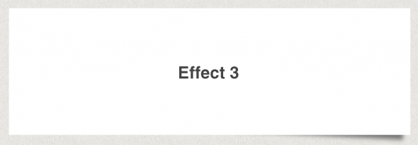
Effect 4 will lift the corner on the bottom right of the box.
HTML: <div class=”box effect3″>
<h3>Effect 3</h3>
</div>
CSS: .box h3 {
text-align:center;
position:relative;
top:80px;
}.box {
width:70%;
height:200px;
background:#FFF;
margin:40px auto;}/*==================================================
* Effect 3
* ===============================================*/.effect3 {
position: relative;
}.effect3:after {
z-index: -1;
position: absolute;
content: “”;
bottom: 15px;
right: 10px;
left: auto;
width: 50%;
top: 80%;
max-width:300px;
background: #777;
-webkit-box-shadow: 0 15px 10px #777;
-moz-box-shadow: 0 15px 10px #777;
box-shadow: 0 15px 10px #777;
-webkit-transform: rotate(3deg);
-moz-transform: rotate(3deg);
-o-transform: rotate(3deg);
-ms-transform: rotate(3deg);
transform: rotate(3deg);
}
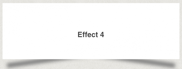
This is expands on the effect 2 and will increase the angle of the shadows.
HTML: <div class=”box effect4″>
<h3>Effect 4</h3>
</div>
CSS: .box h3 {
text-align:center;
position:relative;
top:80px;
}.box {
width:70%;
height:200px;
background:#FFF;
margin:40px auto;}/*==================================================
* Effect 4
* ===============================================*/.effect4 {
position: relative;
}
.effect4:before, .effect4:after {
z-index: -1;
position: absolute;
content: “”;
bottom: 25px;
left: 10px;
width: 50%;
top: 80%;
max-width:300px;
background: #777;
-webkit-box-shadow: 0 35px 20px #777;
-moz-box-shadow: 0 35px 20px #777;
box-shadow: 0 35px 20px #777;
-webkit-transform: rotate(-8deg);
-moz-transform: rotate(-8deg);
-o-transform: rotate(-8deg);
-ms-transform: rotate(-8deg);
transform: rotate(-8deg);
}
.effect4:after {
-webkit-transform: rotate(8deg);
-moz-transform: rotate(8deg);
-o-transform: rotate(8deg);
-ms-transform: rotate(8deg);
transform: rotate(8deg);
right: 10px;
left: auto;
}
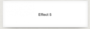
This effect will create a curved shadow at the bottom of the box.
HTML: <div class=”box effect5″>
<h3>Effect 5</h3>
</div>
CSS: .box h3{
text-align:center;
position:relative;
top:80px;
}.box {
width:70%;
height:200px;
background:#FFF;
margin:40px auto;
}/*==================================================
* Effect 5
* ===============================================*/.effect5 {
position:relative;
-webkit-box-shadow:0 1px 4px rgba(0, 0, 0, 0.3), 0 0 40px rgba(0, 0, 0, 0.1) inset;
-moz-box-shadow:0 1px 4px rgba(0, 0, 0, 0.3), 0 0 40px rgba(0, 0, 0, 0.1) inset;
box-shadow:0 1px 4px rgba(0, 0, 0, 0.3), 0 0 40px rgba(0, 0, 0, 0.1) inset;
}
.effect5:before, .effect5:after {
content:””;
position:absolute;
z-index:-1;
-webkit-box-shadow:0 0 20px rgba(0,0,0,0.8);
-moz-box-shadow:0 0 20px rgba(0,0,0,0.8);
box-shadow:0 0 20px rgba(0,0,0,0.8);
top:50%;
bottom:0;
left:10px;
right:10px;
-moz-border-radius:100px / 10px;
border-radius:100px / 10px;
}.effect5:after {
right:10px;
left:auto;
-webkit-transform:skew(8deg) rotate(3deg);
-moz-transform:skew(8deg) rotate(3deg);
-ms-transform:skew(8deg) rotate(3deg);
-o-transform:skew(8deg) rotate(3deg);
transform:skew(8deg) rotate(3deg);
}
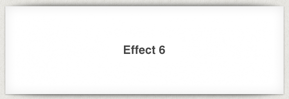
This effect uses the previous effect and adds another shadow to the top of the box.
HTML: <div class=”box effect6″>
<h3>Effect 6</h3>
</div>
CSS: .box h3 {
text-align:center;
position:relative;
top:80px;
}.box {
width:70%;
height:200px;
background:#FFF;
margin:40px auto;}/*==================================================
* Effect 6
* ===============================================*/.effect6 {
position:relative;
-webkit-box-shadow:0 1px 4px rgba(0, 0, 0, 0.3), 0 0 40px rgba(0, 0, 0, 0.1) inset;
-moz-box-shadow:0 1px 4px rgba(0, 0, 0, 0.3), 0 0 40px rgba(0, 0, 0, 0.1) inset;
box-shadow:0 1px 4px rgba(0, 0, 0, 0.3), 0 0 40px rgba(0, 0, 0, 0.1) inset;
}.effect6:before, .effect6:after {
content:””;
position:absolute;
z-index:-1;
-webkit-box-shadow:0 0 20px rgba(0,0,0,0.8);
-moz-box-shadow:0 0 20px rgba(0,0,0,0.8);
box-shadow:0 0 20px rgba(0,0,0,0.8);
top:0;
bottom:0;
left:10px;
right:10px;
-moz-border-radius:100px / 10px;
border-radius:100px / 10px;
}
.effect6:after {
right:10px;
left:auto;
-webkit-transform:skew(8deg) rotate(3deg);
-moz-transform:skew(8deg) rotate(3deg);
-ms-transform:skew(8deg) rotate(3deg);
-o-transform:skew(8deg) rotate(3deg);
transform:skew(8deg) rotate(3deg);
}
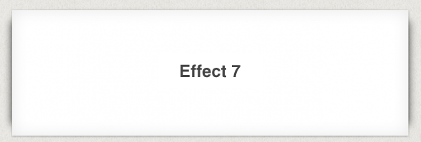
The final effect will add rounded shadows to either side of the box.
HTML: <div class=”box effect7″>
<h3>Effect 7</h3>
</div>
CSS: .box h3 {
text-align:center;
position:relative;
top:80px;
}.box {
width:70%;
height:200px;
background:#FFF;
margin:40px auto;}/*==================================================
* Effect 7
* ===============================================*/.effect7 {
position:relative;
-webkit-box-shadow:0 1px 4px rgba(0, 0, 0, 0.3), 0 0 40px rgba(0, 0, 0, 0.1) inset;
-moz-box-shadow:0 1px 4px rgba(0, 0, 0, 0.3), 0 0 40px rgba(0, 0, 0, 0.1) inset;
box-shadow:0 1px 4px rgba(0, 0, 0, 0.3), 0 0 40px rgba(0, 0, 0, 0.1) inset;
}
.effect7:before, .effect7:after {
content:””;
position:absolute;
z-index:-1;
-webkit-box-shadow:0 0 20px rgba(0,0,0,0.8);
-moz-box-shadow:0 0 20px rgba(0,0,0,0.8);
box-shadow:0 0 20px rgba(0,0,0,0.8);
top:10px;
bottom:10px;
left:0;
right:0;
-moz-border-radius:100px / 10px;
border-radius:100px / 10px;
}
.effect7:after {
right:10px;
left:auto;
-webkit-transform:skew(8deg) rotate(3deg);
-moz-transform:skew(8deg) rotate(3deg);
-ms-transform:skew(8deg) rotate(3deg);
-o-transform:skew(8deg) rotate(3deg);
transform:skew(8deg) rotate(3deg);
}
So, you see. These are just some of the effects which you can achieve using CSS3 and HTML 5. Keep practicing
Original article: http://www.paulund.co.uk/creating-different-css3-box-shadows-effects