
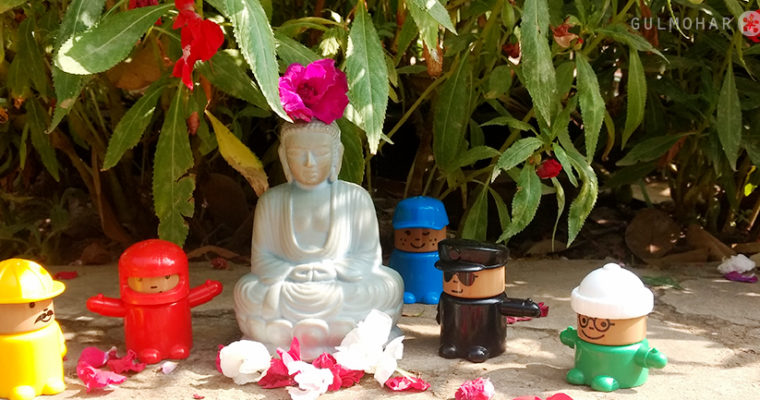
Happy Friday Folks!!!
Be grateful that you don’t have everything you want now. That means, you have the opportunity to be happier tomorrow than you are today…. 🙂 Happy Friday Folks!!!
Be grateful that you don’t have everything you want now. That means, you have the opportunity to be happier tomorrow than you are today…. 🙂 Happy Friday Folks!!!
If you think, you are too small to make a difference…Try sleeping with a mosquito… 😀 😀
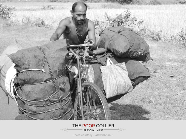
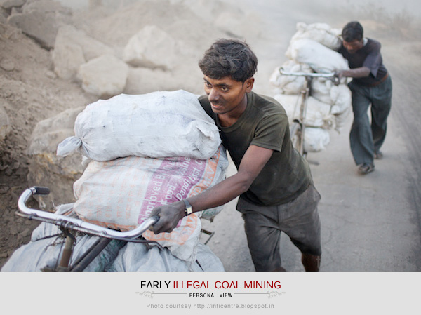
Photo courtesy: http://inficentre.blogspot.in
“Hard work spotlights the character of people: some turn up their sleeves, some turn up their noses, and some don’t turn up at all.” -Sam Ewing
At a production rate of over 300 million tonnes (MT) per year, India is the third-largest coal miner after China and the US. Until the 1980s, much of India’s coal was extracted from the eastern coalfields (Jharia and Raniganj) in Jharkhand/West Bengal. Now, with the thrust on industrial development, besides intensifying extraction in existing projects through increased mechanization, other coalfields have opened up around India, in particular, the central coalfields of North Karanpura, stretching across Jharkhand (once south Bihar) to the west of Dhanbad, the ‘coal’ capital of India, located on the Jharia coalfields. The Raniganj–Jharia coalfields are still significant, producing about 25 MT per year.
Regardless of this, a major section of jobless people in the mining areas of Jharkhand do not have any choice but to support the illegal trade. They often risk their lives to enter into dangerous mines to earn some bucks to feed their families. It is said that hard work is the yeast that raises the dough. But, when I saw these colliers (koyla cycle wallahs), wobbling and pushing their bikes laden high with stolen coal, slowly making their way through the steep and twisting forest roads on my trip to Jharkhand this time, I saw and felt the pain they go through every single day in their life! They push bicycles carrying huge loads of crudely-coked coal in jute sacks for approx 70kms every alternate day! Their life is typical of that of many thousands of Jharkhand illegal coal miners. The irksome job they do everyday just leaves them with all the tiredness, diseases and a huge hole in their hearts. To grow up here is to know that death, massive and swift, can come at any time.
Life of a collier starts early around 3:00 am. They pack their tiffins and leave their home by 3:30 am. Reaching the colliery and mining the coal takes around 4-5 hours of tough hard work. They have to finish this as soon as possible fearing the police raids. But it doesn’t stop here for them. Once the coal is mined and is taken out, it is packed in large sacks and is then tied on their bicycles. Each collier travels 70km approx carrying around 1-5 quintal (1quintal=100 kgs) of coal every alternate day. The sacks are heavy and their body is thin… The hectic job of dragging these bicycles for so long takes a minimum of 12 hours and a maximum of 24 hours depending on their strength. They pant: they rest, they chat: they smile: they sing, they laugh… its certainly not a bed full of roses for them. Carrying so much weight for such long hours, affects their lungs the most. Most well known is a condition called pneumoconiosis, which is the name given to a group of lung diseases caused by the inhalation and retention of dust of various sorts. It’s also called industrial dust disease. In miners coal dust is to blame and the condition is also known as black lung disease or anthracosilicosis. They are also very much prone to diseases like Tuberculosis (TB), emphysema and chronic bronchitis at a very early stage of their life. It is not surprising that most of these colliers die in their early 40′s and 50′s. A day of hard work, mining, carrying, selling takes a toll on their body, mind and heart. They work a day and are not able to move the next day. Their body gives up! But they have to survive in this cruel world. So, they rise again and repeat the same story every alternate day! All these hard work and at the end of the day what they earn is rupees 500 – 1800!
Indira Gandhi once said –“My grandfather told me that there were two kinds of people: those who do the work and those who take the credit. He told me to try to be in the first group; there was much less competition.”
Similarly, my father told me a very interesting story about them this time. He said that there are often police raids for such illegal activities and people who are caught are severely punished. But this time, the DSP did a strange thing which changed the perspective of these colliers towards the police totally. Generally, during such police raids, they catch the colliers who ride bicycle as it is easy to catch them riding on vehicles. The bigger mafias who carry such illegal activities in big trucks, bikes and other vehicle for carrying coal, generally escapes. They have a big group and somehow they get the news and it doesn’t take much time for them to fly away on their respective vehicles. But these colliers who carry the coal on bicycles are not able to do so and hence are caught easily.
So, this time when 10 of them were caught, they were stopped and were asked to drag their bicycles to the police station. When the DSP saw this, he ordered some of his policemen to drag the bicycle instead as most of the colliers were old men. Surprisingly, none of the police man was able to drag the heavy bicycle for more than 10 steps. They were badly panting and were not in a position to move the bicycle an inch more. Seeing this, the DSP said -”Young people like you are not able to move these bicycles for 70 meters, think how these old men drag it for 70 kilometers every alternate day! Think about the real hard work they do just to buy two meals per day for their poor families. If you really wanna do something, catch hold of them who carry this illegal trade on vehicles. They are the real culprits! He let the old colliers leave.
Now, some of you may ask.. if it is illegal why they have to do this? Why can’t they search for some other job? When they are aware of the risks of coal mining why can’t they save themselves? The answer can be many. But the main answer is unemployment and illiteracy! These people are generally very less or not literate at all since most of them start helping their parents at a very early age. The age can vary between 4-12. Often, they aren’t allowed to go to school as they have hungry and sick people at home to feed and cure. Medicines are expensive and the food prices have increased. They can’t opt for other jobs as most of the shops need a literate worker. They can choose to work in fields which they generally do during the monsoons as the mines get filled with water and it is not possible for them to enter it. But what they earn is maximum 120/- per day for 8-9 hours of hard work according to the going Jharkhand labor rate. So, even if they work for a week what they earn will be 840 rupees. Is this sufficient for a family to survive in today’s economy? The answer is a big NO! The income doesn’t even compare, so it is clear why someone with no employment opportunities would choose this work, despite the dangers.
These colliers by no means want their children to follow their path. They want them to study and become a “BIG MAN“. So that they don’t have to do such hard work and they too can have a good life! They can support their families better. This leaves me with the thought that does hard work really pay? Just for their sheer strength, determination and endurance (despite back-breaking experience), I admire them, if not endorse. To me they are the real HE-MEN, rather than COAL-BLOODED HE-MEN!! I hope some day their dreams come true and they lead a much more healthier and happier life…
Amen..
You can view the sad story of this koyla cycle wallahs beautifully captured by Sophie Gerrard here.
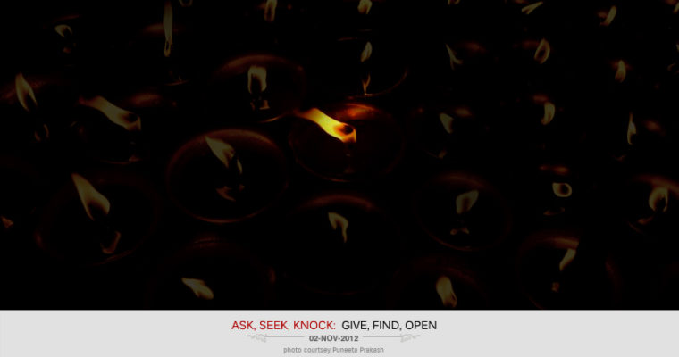
“Ask, and it shall be Given to you;Seek, and you shall Find;Knock, and it shall be Opened unto you.” – Matthew 7:7
“No matter how good or bad you think life is, wake up each day and be thankful for life. Someone somewhere else is fighting to survive…”
In my last blog post, I explained how to give simple box-shadows. Wasn’t it simple and cool?? Box-shadow is a pretty powerful property in modern browsers. With just six little values, you can make some really neat stuff. Box-shadow has six properties: inset, left, top, blur, size, and color. Today, we will learn about some advanced drop-shadow effects using :after and :before, these can be useful for adding effects without putting more markup in and can be applied to a single element. A couple of pseudo-elements are generated from an element and then pushed behind it.
:after and :before
The “:before” pseudo-element can be used to insert some content before the content of an element. Similarly, the “:after” pseudo-element can be used to insert some content after the content of an element.
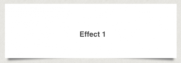
This effect will add shadows to the bottom corners of the boxes to create a lifted corner look on the boxes. This effect uses both the :before and :after properties to create new elements used for the corners.
HTML: <div class=”box effect1″>
<h3>Effect 2</h3>
</div>
CSS: .box h3 {
text-align:center;
position:relative;
top:80px;
}.box {
width:70%;
height:200px;
background:#FFF;
margin:40px auto;}/*==================================================
* Effect 1
* ===============================================*/.effect1 {
position: relative;
}.effect1:before, .effect1:after {
z-index: -1;
position: absolute;
content: “”;
bottom: 15px;
left: 10px;
width: 50%;
top: 80%;
max-width:300px;
background: #777;
-webkit-box-shadow: 0 15px 10px #777;
-moz-box-shadow: 0 15px 10px #777;
box-shadow: 0 15px 10px #777;
-webkit-transform: rotate(-3deg);
-moz-transform: rotate(-3deg);
-o-transform: rotate(-3deg);
-ms-transform: rotate(-3deg);
transform: rotate(-3deg);
}
.effect1:after {
-webkit-transform: rotate(3deg);
-moz-transform: rotate(3deg);
-o-transform: rotate(3deg);
-ms-transform: rotate(3deg);
transform: rotate(3deg);
right: 10px;
left: auto;
}

This uses half of the effect approve and will add a lifted corner to the bottom left of the box.
HTML: <div class=”box effect2″>
<h3>Effect 3</h3>
</div>
CSS: .box h3 {
text-align:center;
position:relative;
top:80px;
}.box {
width:70%;
height:200px;
background:#FFF;
margin:40px auto;}/*==================================================
* Effect 2
* ===============================================*/.effect2 {
position: relative;
}.effect2:before {
z-index: -1;
position: absolute;
content: “”;
bottom: 15px;
left: 10px;
width: 50%;
top: 80%;
max-width:300px;
background: #777;
-webkit-box-shadow: 0 15px 10px #777;
-moz-box-shadow: 0 15px 10px #777;
box-shadow: 0 15px 10px #777;
-webkit-transform: rotate(-3deg);
-moz-transform: rotate(-3deg);
-o-transform: rotate(-3deg);
-ms-transform: rotate(-3deg);
transform: rotate(-3deg);
}

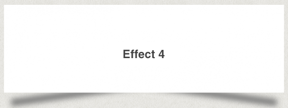
Effect 4 will lift the corner on the bottom right of the box.
HTML: <div class=”box effect3″>
<h3>Effect 3</h3>
</div>
CSS: .box h3 {
text-align:center;
position:relative;
top:80px;
}.box {
width:70%;
height:200px;
background:#FFF;
margin:40px auto;}/*==================================================
* Effect 3
* ===============================================*/.effect3 {
position: relative;
}.effect3:after {
z-index: -1;
position: absolute;
content: “”;
bottom: 15px;
right: 10px;
left: auto;
width: 50%;
top: 80%;
max-width:300px;
background: #777;
-webkit-box-shadow: 0 15px 10px #777;
-moz-box-shadow: 0 15px 10px #777;
box-shadow: 0 15px 10px #777;
-webkit-transform: rotate(3deg);
-moz-transform: rotate(3deg);
-o-transform: rotate(3deg);
-ms-transform: rotate(3deg);
transform: rotate(3deg);
}
This is expands on the effect 2 and will increase the angle of the shadows.
HTML: <div class=”box effect4″>
<h3>Effect 4</h3>
</div>
CSS: .box h3 {
text-align:center;
position:relative;
top:80px;
}.box {
width:70%;
height:200px;
background:#FFF;
margin:40px auto;}/*==================================================
* Effect 4
* ===============================================*/.effect4 {
position: relative;
}
.effect4:before, .effect4:after {
z-index: -1;
position: absolute;
content: “”;
bottom: 25px;
left: 10px;
width: 50%;
top: 80%;
max-width:300px;
background: #777;
-webkit-box-shadow: 0 35px 20px #777;
-moz-box-shadow: 0 35px 20px #777;
box-shadow: 0 35px 20px #777;
-webkit-transform: rotate(-8deg);
-moz-transform: rotate(-8deg);
-o-transform: rotate(-8deg);
-ms-transform: rotate(-8deg);
transform: rotate(-8deg);
}
.effect4:after {
-webkit-transform: rotate(8deg);
-moz-transform: rotate(8deg);
-o-transform: rotate(8deg);
-ms-transform: rotate(8deg);
transform: rotate(8deg);
right: 10px;
left: auto;
}

This effect will create a curved shadow at the bottom of the box.
HTML: <div class=”box effect5″>
<h3>Effect 5</h3>
</div>
CSS: .box h3{
text-align:center;
position:relative;
top:80px;
}.box {
width:70%;
height:200px;
background:#FFF;
margin:40px auto;
}/*==================================================
* Effect 5
* ===============================================*/.effect5 {
position:relative;
-webkit-box-shadow:0 1px 4px rgba(0, 0, 0, 0.3), 0 0 40px rgba(0, 0, 0, 0.1) inset;
-moz-box-shadow:0 1px 4px rgba(0, 0, 0, 0.3), 0 0 40px rgba(0, 0, 0, 0.1) inset;
box-shadow:0 1px 4px rgba(0, 0, 0, 0.3), 0 0 40px rgba(0, 0, 0, 0.1) inset;
}
.effect5:before, .effect5:after {
content:””;
position:absolute;
z-index:-1;
-webkit-box-shadow:0 0 20px rgba(0,0,0,0.8);
-moz-box-shadow:0 0 20px rgba(0,0,0,0.8);
box-shadow:0 0 20px rgba(0,0,0,0.8);
top:50%;
bottom:0;
left:10px;
right:10px;
-moz-border-radius:100px / 10px;
border-radius:100px / 10px;
}.effect5:after {
right:10px;
left:auto;
-webkit-transform:skew(8deg) rotate(3deg);
-moz-transform:skew(8deg) rotate(3deg);
-ms-transform:skew(8deg) rotate(3deg);
-o-transform:skew(8deg) rotate(3deg);
transform:skew(8deg) rotate(3deg);
}

This effect uses the previous effect and adds another shadow to the top of the box.
HTML: <div class=”box effect6″>
<h3>Effect 6</h3>
</div>
CSS: .box h3 {
text-align:center;
position:relative;
top:80px;
}.box {
width:70%;
height:200px;
background:#FFF;
margin:40px auto;}/*==================================================
* Effect 6
* ===============================================*/.effect6 {
position:relative;
-webkit-box-shadow:0 1px 4px rgba(0, 0, 0, 0.3), 0 0 40px rgba(0, 0, 0, 0.1) inset;
-moz-box-shadow:0 1px 4px rgba(0, 0, 0, 0.3), 0 0 40px rgba(0, 0, 0, 0.1) inset;
box-shadow:0 1px 4px rgba(0, 0, 0, 0.3), 0 0 40px rgba(0, 0, 0, 0.1) inset;
}.effect6:before, .effect6:after {
content:””;
position:absolute;
z-index:-1;
-webkit-box-shadow:0 0 20px rgba(0,0,0,0.8);
-moz-box-shadow:0 0 20px rgba(0,0,0,0.8);
box-shadow:0 0 20px rgba(0,0,0,0.8);
top:0;
bottom:0;
left:10px;
right:10px;
-moz-border-radius:100px / 10px;
border-radius:100px / 10px;
}
.effect6:after {
right:10px;
left:auto;
-webkit-transform:skew(8deg) rotate(3deg);
-moz-transform:skew(8deg) rotate(3deg);
-ms-transform:skew(8deg) rotate(3deg);
-o-transform:skew(8deg) rotate(3deg);
transform:skew(8deg) rotate(3deg);
}
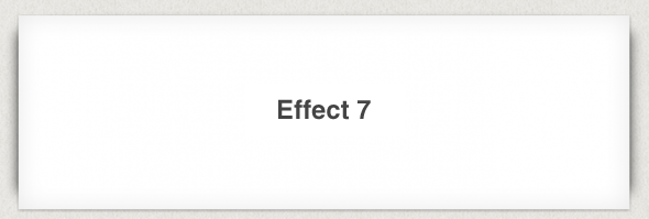
The final effect will add rounded shadows to either side of the box.
HTML: <div class=”box effect7″>
<h3>Effect 7</h3>
</div>
CSS: .box h3 {
text-align:center;
position:relative;
top:80px;
}.box {
width:70%;
height:200px;
background:#FFF;
margin:40px auto;}/*==================================================
* Effect 7
* ===============================================*/.effect7 {
position:relative;
-webkit-box-shadow:0 1px 4px rgba(0, 0, 0, 0.3), 0 0 40px rgba(0, 0, 0, 0.1) inset;
-moz-box-shadow:0 1px 4px rgba(0, 0, 0, 0.3), 0 0 40px rgba(0, 0, 0, 0.1) inset;
box-shadow:0 1px 4px rgba(0, 0, 0, 0.3), 0 0 40px rgba(0, 0, 0, 0.1) inset;
}
.effect7:before, .effect7:after {
content:””;
position:absolute;
z-index:-1;
-webkit-box-shadow:0 0 20px rgba(0,0,0,0.8);
-moz-box-shadow:0 0 20px rgba(0,0,0,0.8);
box-shadow:0 0 20px rgba(0,0,0,0.8);
top:10px;
bottom:10px;
left:0;
right:0;
-moz-border-radius:100px / 10px;
border-radius:100px / 10px;
}
.effect7:after {
right:10px;
left:auto;
-webkit-transform:skew(8deg) rotate(3deg);
-moz-transform:skew(8deg) rotate(3deg);
-ms-transform:skew(8deg) rotate(3deg);
-o-transform:skew(8deg) rotate(3deg);
transform:skew(8deg) rotate(3deg);
}
So, you see. These are just some of the effects which you can achieve using CSS3 and HTML 5. Keep practicing
Original article: http://www.paulund.co.uk/creating-different-css3-box-shadows-effects
The evolution of CSS3 and HTML 5 has actually made it possible to create drop-shadows using pseudo-elements. It’s a nice and robust way to progressively enhance a design. A couple of pseudo-elements (.drop-shadow:before, .drop-shadow:after) are generated from an element and then pushed behind it. The …
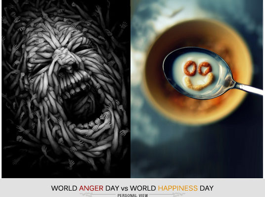
Speak when you are angry and you will make the best speech you will ever regret.” ― Ambrose Bierce Today (August 28) is World Anger Day (did we need a reminder?). Seriously, had never heard about this day until today…! So, are we supposed to …
Motivation is a fire from within. If someone else tries to light that fire under you, chances are it will burn very briefly.
~ Stephen Covey
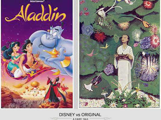
Photo and story courtesy: en.wikipedia.org/wiki/Aladdin Remember Disney’s animated movie “Aladdin and the magic lamp”? It was so much fun watching the movie as a kid…Perhaps, now what we remember is only the Disney version; with Aladdin, a fat genie, a naughty monkey, a beautiful Persian …