Sleek CSS3 Drop Shadow Effect Without Images
The evolution of CSS3 and HTML 5 has actually made it possible to create drop-shadows using pseudo-elements. It’s a nice and robust way to progressively enhance a design. A couple of pseudo-elements (.drop-shadow:before, .drop-shadow:after) are generated from an element and then pushed behind it. The pseudo-elements need to be positioned and given explicit or implicit dimensions. The next step is to add a CSS3 box-shadow and apply CSS3 transforms. Different types of drop-shadow can be produced by varying these values and the types of transforms applied. The box-shadow property allows you to easily create multiple drop shadows on box elements by specifying values for colour, size, blur and offset.
box-shadow property:
The box-shadow property allows you to add multiple shadows (outer or inner) on box elements. To do that you must specify values as: color, size, blur and offset.box-shadow: horizontal vertical blur spread colour;
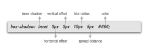
- A positive value for the horizontal offset draws a shadow that is offset to the right of the box, a negative length to the left.
- The second length is the vertical offset. A positive value for the vertical offset basically offsets the shadow down, a negative one up.
- You’re not allowed to use negative values for blur radius. The larger the value, the more the shadow’s edge is blurred, as it can be seen above.
- Spread distance positive values cause the shadow shape to expand in all directions by the specified radius.
- Negative ones cause the shadow shape to contract.
- The color is the color of the shadow.
- The inset keyword , changes the drop shadow from an outer shadow to an inner shadow. Exclude the word if you want an outer shadow.
Examples: box-shadow: 10px 10px; box-shadow: 10px 10px 5px #888888; box-shadow: inset 2px 2px 2px 2px #000000; box-shadow: 10px 10px #888888, -10px -10px #f4f4f4, 0px 0px 5px 5px #cc6600;
Enough theory, let’s see some stuff!!
Code:
-moz-box-shadow: 3px 3px 5px 6px #666666;
-webkit-box-shadow: 3px 3px 5px 6px #666666;
box-shadow: 3px 3px 5px 6px #666666;
}
Code:
.shadow {
-webkit-box-shadow: 0 8px 6px -6px #000000;
-moz-box-shadow: 0 8px 6px -6px #000000;
box-shadow: 0 8px 6px -6px #000000;
}
Code:
.shadow {
-moz-box-shadow: 0 0 5px #000000;
-webkit-box-shadow: 0 0 5px #000000;
box-shadow: 0 0 5px #000000;
}
Browser Support:
All of the major newest browsers support box-shadow property.
- Internet Explorer 9.0 and higher
- Firefox 3.5 and higher
- Chrome 1 and higher
- Safari 3 and higher
- Opera 10.5 and higher
With many new CSS3 properties you need to prefix the property with browser specific tags.
- For firefox you need to use -moz-, for chrome/safari you need to use -webkit.
- The box-shadow property is no different.
- For Firefox 3.5 you need to prefix with -moz-boz-shadow, but for Firefox 4.0 and higher you don’t need to use the prefix anymore.
- For Chrome/safari you still need to use the -webkit-box-shadow.
- For opera you don’t need to prefix the property and can just use box-shadow.
Enjoy playing with the different values. Next post will be on how to give advanced drop shadows. Keep practicing till then